I decided for this brief that when I think of cheap and nasty things people don't really see as appealing Frosty Jacks would be perfect to re-brand as a high class product appealing to a completely different market to show the effect branding has on consumer opinion and the kind of people drawn to buying things. I thought a good place to start my research was looking at the current brand/company that makes the product (Aston Manor). One thing they advertise on the website is the different packaging you can buy their ciders in, I will consider the branding for all of these within my practical.
The company Aston Manor makes all different cider products from its orchard, I think relating more to the ciders routes in its branding and relationship with the audience will effectively increase the value of the product. Branding is just as much about attractiveness as it is brand personality. I think showing the brands background more in the aesthetic and design will effectively create a better brand-customer relationship.

Above are examples of the current packaging. The typeface is almost script and isn't very appealing to a broad audience like a more simple/minimal typeface would be, it isn't very timeless. The plastic bottles definitely make the product seem cheap, all the more expensive ciders are in glass bottles and is just automatically related to more high class brands. I do however like the blue bottles and think this element could be continued into the new branding. I aim to go for a much more minimal and sleek look, use glass bottles and overall make the brand aim towards a higher class market and increase the profit margins.
https://www.behance.net/gallery/21714645/White-Pike-Whiskey
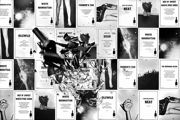
One of the most inspirational alcohol branding projects I looked at is this one for White Pike Whiskey. I love that the brand considered all forms of promotion and how each element of the packaging works together. This is really appealing and reinforces the brands message. I love the minimal and clean look, its classy and appeals to a wide audience because of this as theres no overpowering appeal to a certain gender or age group.
The poster is printed on thin looking stock and in black and white, this gives quite a punk zine aesthetic and gives the brand a personal touch that appeals to the audience well. I think home made looking parts to a brand makes an audience appreciate the effort put into the packaging more and will give a closer bond with the product. The layout is minimal and simple like the bottle and really effective.
The poster is made up firstly of photography, some is provocative and much like the research I did into CK perfume suggests a fun/party lifestyle related to the brand. This subliminally suggests buying the product will improve certain elements of life. It also has recipes for cocktails you can make with the product, giving your audience options and suggestions is effective as their persuaded to buy the brand to try new things and be a more adventurous person.
Close up of some smaller photographic posters.
Abstract t-shirt, could be given to bars as a promotional piece with the brand identity on the back. This is something I will consider creating for my branding.
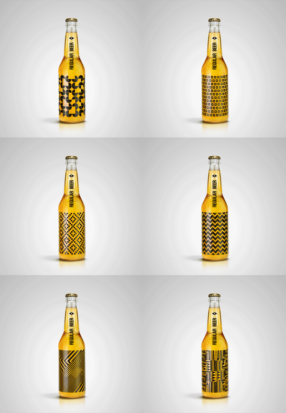
When looking at inspirational aesthetics I focused a lot on simple geometric shapes in use, above is a good example of this.
I also looked briefly into more intricate illustration based designs.
I actually experimented with doing a similar detailed design style for the re-brand. I hand drew letters and created a vector from them but part of the way through decided a much simpler design was more appropriate as it appeals to a wider audience but the experimentation was still good.
I really liked this design aesthetic and thought I could create a similar thing using a snowflake (relative to the name Frosty Jacks) as part of the pattern possibly? I think a lot of bottle design these days is quite decorative and overloaded with imagery so the more clean and simple designs stand out among the crowd.
This next design is focusing on pattern design, this could be effective as the pattern could change with each flavour of cider etc. I like the idea of having the type along the neck of the bottle and having a minimal main label. Also GIFs are something im really getting into at the moment as far as promotion goes as its a different and interactive way of advertisement and it would be interesting to try and use them within my branding.
More examples of inspiration and minimal branding.
These beers are brewed and designed by the design company Snask. The thing that really stood out to me about them is the colour scheme, the pastel colours on the dark background really pops and is appealing within contemporary design. The hand drawn esce type gives it a personal touch once again giving a closeness between brand and consumer.
https://www.youtube.com/watch?v=TtRUnTcS5PQ


.png)


No comments:
Post a Comment