
My initial production plan was the screen print IK Blue (the closest colour possible) onto my Candy Pink colourplan stock. The idea was to mimic a one off riso-print (as this process is basically a digital version of screen printing). Screen printing just a small run would essentially be a money saving option giving a similar DIY informed aesthetic to the posters.

For this process I prepared two a2 textile screens; I used textile screens as oppose to paper screens as the mesh allows more ink through so small type can be printed.


I mixed the brightest dark blue (closest to IK) possible.


Unfortunately the screens were being very temperamental; some areas were bleeding too much ink and others not taking at all. This could of been due to; them being textile screens, the screens not being large enough, the coating not being solid enough.
Nethertheless I felt trying some other print methods to create a more final and perfect print was needed.

My second print process attempt was using a lazer printer. This is still appropriate as many underground press publications will of used this method or used a photocopier due to it being cheap.
This did however mean I had to sacrifice the IK blue and print in black. I also had to change to a thinner pink printing stock.


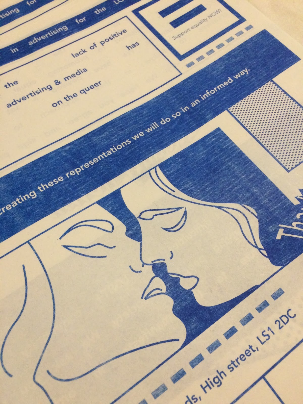
My third and final print process used was actually my initial idea (not previously used due to a large cost for a short run). I decided to risograph-print my manifesto posters. The process of risograph printing effectively is a mixture between the two previous process' tried - photocopying and screen-printing. It is very cheap for large runs so in terms of commercial production this print method would be perfect. Its produced using a thin plastic, the printer then burns holes in this where the ink is then allowed through - similar to the process of exposing a screen for screen printing. This 'master layer' then wraps around the ink barrel allowing one colour prints to be produced extremely quickly; further colours can then be layered on top of one another.
This process allowed me to print in bright blue (not quite IK unfortunately but in a commercial sense this could be possible using riso). It also allowed me to use my original choice of the high quality candy pink colourplan stock. This print method was perfect as it didn't mean I needed to sacrifice any of my design decisions or aesthetic; it also gave me the opportunity to learn more first hand about the process.
The machine I used restricted me to a3 prints; if printed commercially I would print a2 for maximum impact of the design. But a3 is perfectly legible and allows the reader to fill in the signature section easily at this size.


The first and very important part of the process was to produce some mock-up run throughs of the print using plain cheap stock.

This allowed me to check all the colours were coming out correct and also that the fold line was central. Which it was not, but brilliantly this was something that could be amended on the printer itself rather than having to edit the file.

It also allowed me to see how the prints would come out. As the machine warms up the ink becomes more and more clear. This means the prints vary in ink thickness; this gives a really interesting DIY feeling aesthetic to the final prints which is very relevant and effective for this brief.


These videos show the printers at work producing my design. The risograph process is extremely quick and cost effective once the initial master copy has been produced (this is the part which makes it cost so much for small runs).


As you can see this print process leaves patchyness; which is part of the reason it was desirable to me. it gives each print real personality and an informed aesthetic similar to the zines/newsletters/publications I saw during my primary research. It gives a contemporary adaptation of the historical context of the design.


All the prints vary in patchyness/ink thickness making them feel individual and hand produced; this is important in portraying the friendly tone of voice needed when approaching quite a heavy and serious topic.


Using this print process gave me a positive insight into how mass production of the product would work; the ease, speed and cheap reproduction values of risograph printing has given me a brilliant first experiance and I would most definitely use it again.
The choice of printing was well informed by the contextual research & also by the target audience and contemporary design appeal as it allowed me to use brighter colours than possible on a lazer printer. Which I feel gives a more friendly, appealing and approachable feeling to the brand/campaign overall; essentially this will increase the amount of signatures the campaign would gain, further the cause and help change world views and representations of the LGBT+ community for the better.
Within this process I also decided to experiment with GSM of my chosen stock - Candypink Colourplan. I experimented using 135gsm and 270gsm versions of the stock. I felt that a thinner stock would give a more DIY historically informed feel; but the thicker could feel more 'luxury' and high quality and possibly appeal towards a high end market.
The printer itself got stuck a few times with the thicker stock making it the less desirable choice in this case; the thinner stock is also much cheaper so this choice effects cost effectivity greatly. The historically informed 135gsm is the best option.
No comments:
Post a Comment