I decided an appropriate way of reaching out to the target audience (Graphic designers, advertising agencies, brands, the LGBT+ community etc.) was to produce an online web platform. Its appropriate as it can be accessed by everyone and reach maximum people gaining as many signatures as possible.
In order to gain signatures the website will be friendly, easy to navigate, simple and well informed by the research and context.
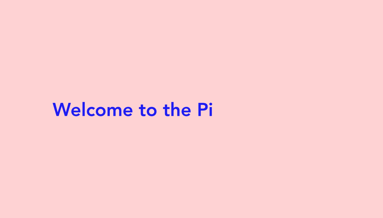
The introduction page will be simplistic - using the typewriter effect.


It will then turn into a warped typography style, this is representative of the warped views society has of the LGBT+ community due to advertising.


The introduction page will then scroll up to reveal a page that will let the campaign know statistics regarding the creative area the person signing onto the manifesto is part of. Once again this screen will use a typewriter effect.


It will scroll up again to reveal the options, Designer, Advertising agency or Brand. Covering the 3 main target audiences I am hoping will sign their names in agreement of the pledge. These options could be added to later to include general public, artists, film makers etc.


Using the tick box system the user can then select their field. Upon selection the page will scroll again to reveal the first of the manifestos rules.

The animation style (typewriter) is informed by 2 things. 1. It looks as if someone is personally speaking/typing to you, gives it a warm and friendly feeling that will be appealing; due to the sense of separation the internet can give you from people. The cause itself is in the interest of people and benefitting society so this is important.
2. The typewriter was a key tool used for the underground press which has had a lot of influence on this project.
This mock up shows the type appearing on the screen.

This mock up shows the statement/rule, each will appear on its own, the idea being you need to accept them one by one in order to move onto the next. Its better than having one web-page with a list of information as this could be overwhelming, confusing and boring to the reader/user.

The animation will then move the type up and the tick box will appear. The user simply has to tick and accept the rule to move onto the next one. Its interactive, clear and really engaging for the user.

This mock up shows the simple appearance when the box is ticked. Important to include this as user experiance needs to be considered to make the website as effective as possible. Visual queues that show the website is being reactive increase click through rates, therefore increasing pledges.

Lastly the entire rule and tick-box will scroll upwards off the screen revealing the next one.

Upon the confirmation of the final rule the page will once again scroll up to reveal the screen to officially sign the person or company name onto the manifesto.

It also asks for; location (to be quoted then on the previous signatures section of the website), email - so that a confirmation and thank-you email can be sent out to everyone who signs and a reason for signing once again to be quoted and to give insight into the reasons behind peoples support for the cause.


Once completed the scroll will take the user to the final page. It allows the user to navigate further to find out more about the cause, why their signature matters, allow them to buy promotional merchandise all profits would be arranged to donate to a relevant LGBT charity and look at previous people/brands that have also signed the manifesto.

The simplicity of the website is key as it translate all the information in a concise and not overbearing full on way. But I felt further options in terms of navigation, finding out more before signing, returning visitors was needed. This lead to the addition of a navigation bar.
The nav bar options are
- Start manifesto - allowing users to start the process again if they skipped or mis-read any information previously
- Why you matter - linking to a page of research and facts/write up of why the manifesto matters and explaining the potential damage advertising towards the LGBT community in negative and uninformed ways could have
- Previous signatures - list of people, agencies and brands who have signed on and their reasons as to why
- Merch store - page selling tshirts, badges, posters and other promotional material - profits could then be donated to LGBT charities
- How to positively advertise - a page showing both positive and negative examples of targeted advertising and explanations of why
- The rules - One page with the whole manifesto written out on
- Share - gives options for the user to share the website via various social media outlets

I wanted to ensure each element even down to the small details within the websites design were informed by the context, audience and research. This symbol is the symbol for gay marriage equality and has been adapted in various ways to represent areas of gay rights.

From this I created the design for my small sidebar. When you click on the symbol on the sidebar it expands outwards to become the larger one with the nav options on.


These mock ups show how the site will look with the nav bar added.
No comments:
Post a Comment