Research -
I wanted the design for my publication to be informed by research I had done into historical examples of underground LGBT press and publications. But also consider contemporary styles and adapted aesthetics to appeal to the current audience whilst being informed by the context of the work.
Historical primary research

Throughout my historical research into visual examples of design activism I came across this piece. Sian Cook (2001) a volunteer for the charity, Gay Men Fighting AIDS produced a leaflet design for the prevention of AIDS and discrimination against those living with the disease. The leaflet was cleverly designed using the aesthetic of iconic church symbolism as an overthrow of the discrimination shown by such establishments. The leaflet takes the format of church windows, the typeface is a traditional church themed serif and the images depict stained glass windows illustrated with condoms; all used to provoke thought via the use of visual satire.
Its notable also the style of 'cut out writing' is similar to that used by the sex pistols in their album cover 'never mind the bollocks'. Its representative of the punk aesthetic as a way of protest and social disagreement. This punk denial of form and rules is something I want to follow in my own publication - via layout and print techniques. Creating a post modern layout, that follows no grid and denies rules of modernism would be an effective way of expressing this.


I recorded themes and graphic styles used often throughout the collection - Particularly the use of pastel coloured paper stock and unusual uses of typography.
Contemporary research


I did some research into visual 'postmodern' design examples that expressed a feeling of historical DIY culture whilst still fitting in with contemporary styles and appeals. It inspires unusual uses of typography, a disregard for form, modernism and minimalist ideals.

I began the publication design with a page outlining the campaigns aims.
I decided to use justified type layout as this is considered the be the ultimate opposite to the modernist left flush type justification. Its a subtle informed expression of the design activism within the campaign, by not following 'the rules'.


I designed each section/rule of the manifesto using loose design 'rules' that also expressed the idea of defying modernist values. Using justified type with erratic tracking between words to creating something inconsiderate of legibility. Instead the design is expressive of the punk historical context of the information. Ive included informed/relevant images of LGBT+ targeted adverts and textures that express an idea of 'campness' and flamboyance such as glitter.


Lastly I produced two spreads firstly thanking the reader and secondly giving them the opportunity to pledge their name to the manifesto and send it back to the campaign 'headquarters'. This information would then be published on the online version of the manifesto to promote both the company (for being supportive) and the campaign itself.
This is a video/animation I created to show the book in a digital format. It gives me an idea of how it could look once printed/produced. I will also use this video on the 'rules' page of the website as an engaging alternative to a simple list. It also links both the digital version with the printed for some brand consistency and interactivity.
Possible binding techniques
- No binding - produce a series of small post cards featuring the rules, held together with a belly band
- Staples (typical of historical zines/underground press publications due to the ease of production and affordability)
- Sewn binding - gives a personal and DIY feeling
The choice to not bind the book and instead possibly create a series of prints/postcards is due to the fact that once the company has signed the manifesto in agreement to the rules this part could be sent back (to be published online). The rest of the rules could be then hung/mounted in their office/studio/place of work to remind them they have made this pledge of alliance with the LGBT+ community and will be more likely to remember to be inclusive and informed.

With further research and consideration I felt creating a poster/zine (similar to the layout/format seen above) would be the most appropriate format for this information.


This is my initial design for a poster design, due to the way it would be folded (into eighths). Each rule would be on an individual segment so it could still be separated (using perforation) into individual postcards.
To create this layout I just simply used the existing pages designed for publication format. I felt although this could be effective; the new format should take on a more informed design style. I wanted to create a design that felt almost nostalgic and appreciative of the underground press. I wanted to incorporate simple design techniques used by the LGBT+ community historically to express the punk mindset etc. Some of the design styles iconic of this era of publishing include...
- Outlined type
- Stretched and warped type
- Repetition
- A focus on typography and simple illustration rather than photography
- Pastel coloured stock types
- Cheap print methods (photocopier etc.)
- Typical postmodern design style


These are some initial 'unused' experiments with type expressing this iconic design style.
I wanted my design to express inconsistency in design representative of punk ideals.

This second design is a midway point between the previous and the final. I adapted some of the design techniques I listed but I felt I could take it further; also the format seemed too cramped so I decided it would be better to create something resembling a broadsheet; it then acts as both a poster and a publication in a similar format to my researched newsletters.


Due to the final poster/publication being screen printed or riso-printed the most effective way to creates images would be either using halftone or illustration. I decided due to the large amount of illustration (usually simple and amateur) featured that all images used within my design would be re-created as simple line drawings. The main focus of the manifesto however will be type to reflect the importance of content shown in LGBT+ underground press in a contemporary adapted way.
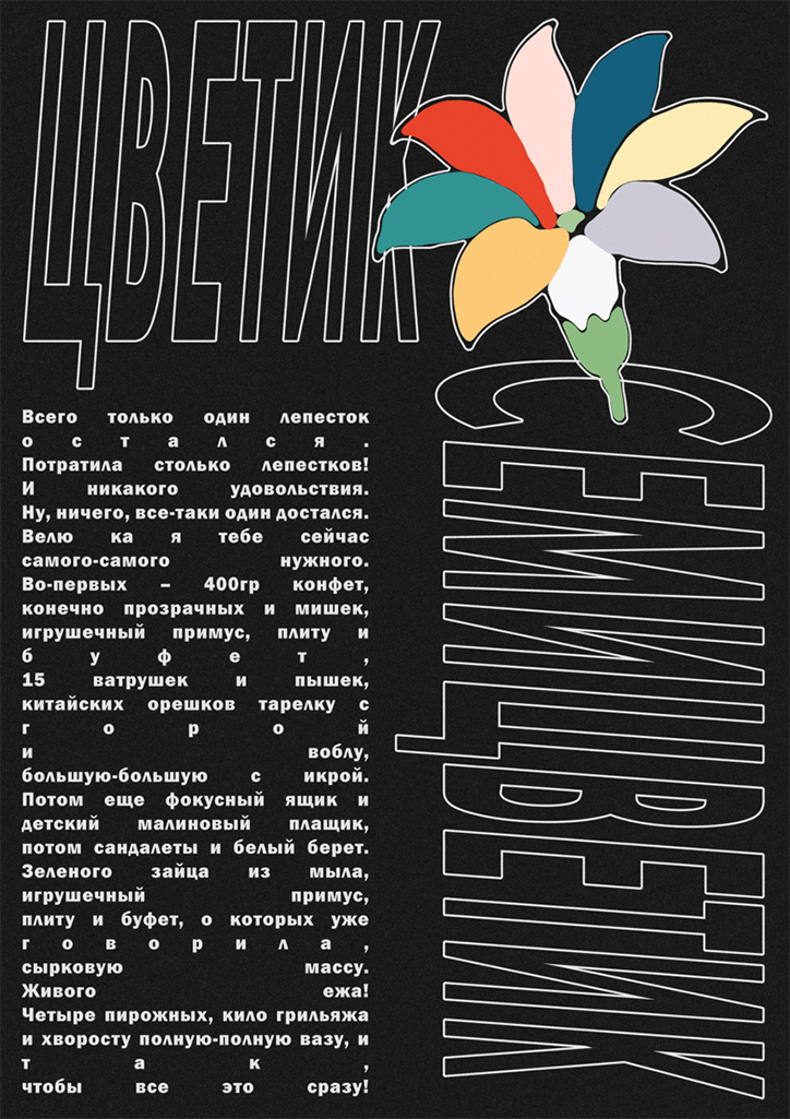
Ive adapted the information and images used within the previous designs into a 'clip art' aesthetic reminiscent of past eras of design activism.
The final design will need to take from as a black positive to be screen printed - as shown above.

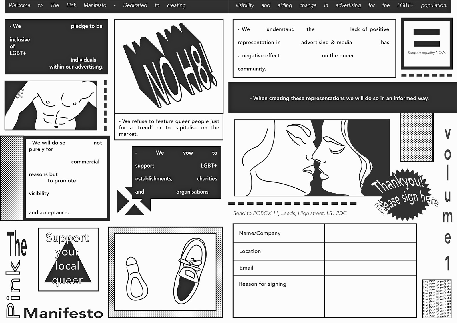
This is the design for effectively the front cover of the spread, although the design will be a poster it also acts as a publication as it will be folded, with content on both sides. I kept the cover pretty simple with bold typography expressing the basic methods and styles used throughout.

This is the first page (left) when the spread is opened. I added in a grid pattern slightly as I felt this addition was ironic as the publication/poster design as a general design is all about defying the grid and other design 'rules'. Using a grid hi-lights this.
Each image, textbox, symbol etc. is separated with a border. The borders are un-equal in stroke width and colour once again expressing a denial of rules and social construct within my design designs.
I designed some simple line drawing versions of some of the relevant images within the spread; creating a contemporary adaptation of the illustrative DIY styles used within underground press publications.
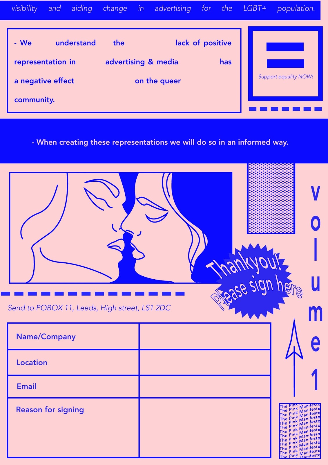
This right hand page features the last of the rules and also the signature box; allowing the reader to pledge to the cause. This section of the poster will be perforated to allow it to be easily separated from the rest of the poster and sent off.
The 'Thankyou, Please sign here' star is reminiscent of historical advertising design. Once again the layout uses the design elements listed previously, outlined type, warped type etc.


Back

Front

Left

Right
Overall I feel the design is successful in portraying the desired punk meets contemporary design message - and this will translate further when screen printed.

For stock choice I decided on Colourplan - Candy pink. This bright pastel stock is similar to the iconic pastel papers used by underground press/LGBT+ publications I discovered within my primary research. The stock brings a high quality, contemporary feel to the design; appealing towards the potentially high end brand audience whilst keeping with the informed theme/aesthetic.
No comments:
Post a Comment