Wednesday, 25 March 2015

Frosty jacks rebrand - Brand personality plan

PLAN
In this brief I need to consider; consistency, brand personality, colour theory, audience, values, familiarity.

Consistency - making sure once my logo, colour scheme and typeface are decided that I stick to these so all related products and marketing are easily recognizable.

Brand personality - this is really important, I want to give off a friendly, trustworthy, fun and high class brand. I want people to look at it and think it was worthy of their money.

Colour theory - looking into the connotations of colour and effects on peoples perceptions of brands due to their use is key to creating a good brand.

Audience - The current audience is considered to be people wanting something cheap and not necessarily good quality. Usually a get drunk cheap and easy solution. My aim is to change this, for the brand to become something people would be proud to drink and think of as high quality.

Values - I dont want the values of my brand to seem negative. I want to promote drinking for please and fun but also in good taste. The current brand suggests to me the values are to serve a purpose to people who possibly drink for the wrong reasons.


Familiarity - I want this to be a re-brand and reemerging of a recognizable product. I want to keep the blue element as this seems to be the best quality of the brand and suggests trustworthiness.

Tuesday, 24 March 2015

Colour theory

After looking at the drastic effect colour can make to a brand I want to explore the connotations of the current brands colours and assess ways of improving it.

I looked firstly at blue, its associated with stability, loyalty, intelligence and truth. These are all essential elements a strong brand should aim to portray to consumers to gain trust and brand loyalty. This gave me pleasure to know my initial thought of keeping the blue was a good one.


Red is also used for the type on the current brand. Although this has the meaning of love it also has negative connotations of stress and anger, two things I definitely do NOT want my re-brand to convey.


Black although having relation to death I feel when it comes to branding in particular definitely gives off the idea of elegance, power and formality. I addressed in my essay the fact that people often are drawn to buying products in the hope of gaining power and elegance. So black has become a consideration for a colour choice.


Green is associated with a lot of positives in the way of nature. But when reading that its often related to finance brands and banking this seemed inappropriate. I want my brand to give off the elements of class and fun (a good time) so green would do the opposite of this.


Orange and yellow both have connotations of happiness. Despite this I am unsure about using them in my re-brand as to me they remind me a little of my childhood. I want to make my product clearly for adults (considering its alcohol). They dont seem quite as appropriate as other options.

In summary im pretty sure black and blue (and white/negative) space would be a good starting point for my re-brand.

Monday, 23 March 2015

Practical research (OUGD401)


I decided for this brief that when I think of cheap and nasty things people don't really see as appealing Frosty Jacks would be perfect to re-brand as a high class product appealing to a completely different market to show the effect branding has on consumer opinion and the kind of people drawn to buying things. I thought a good place to start my research was looking at the current brand/company that makes the product (Aston Manor). One thing they advertise on the website is the different packaging you can buy their ciders in, I will consider the branding for all of these within my practical.


The company Aston Manor makes all different cider products from its orchard, I think relating more to the ciders routes in its branding and relationship with the audience will effectively increase the value of the product. Branding is just as much about attractiveness as it is brand personality. I think showing the brands background more in the aesthetic and design will effectively create a better brand-customer relationship.


Above are examples of the current packaging. The typeface is almost script and isn't very appealing to a broad audience like a more simple/minimal typeface would be, it isn't very timeless. The plastic bottles definitely make the product seem cheap, all the more expensive ciders are in glass bottles and is just automatically related to more high class brands. I do however like the blue bottles and think this element could be continued into the new branding. I aim to go for a much more minimal and sleek look, use glass bottles and overall make the brand aim towards a higher class market and increase the profit margins.

https://www.behance.net/gallery/21714645/White-Pike-Whiskey 


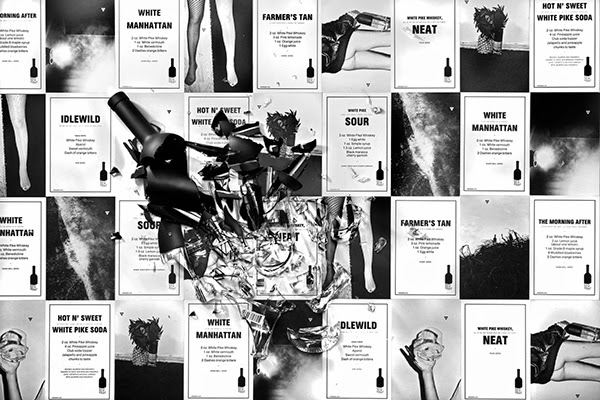
One of the most inspirational alcohol branding projects I looked at is this one for White Pike Whiskey. I love that the brand considered all forms of promotion and how each element of the packaging works together. This is really appealing and reinforces the brands message. I love the minimal and clean look, its classy and appeals to a wide audience because of this as theres no overpowering appeal to a certain gender or age group.


The poster is printed on thin looking stock and in black and white, this gives quite a punk zine aesthetic and gives the brand a personal touch that appeals to the audience well. I think home made looking parts to a brand makes an audience appreciate the effort put into the packaging more and will give a closer bond with the product. The layout is minimal and simple like the bottle and really effective.


The poster is made up firstly of photography, some is provocative and much like the research I did into CK perfume suggests a fun/party lifestyle related to the brand. This subliminally suggests buying the product will improve certain elements of life. It also has recipes for cocktails you can make with the product, giving your audience options and suggestions is effective as their persuaded to buy the brand to try new things and be a more adventurous person.


Close up of some smaller photographic posters.


Abstract t-shirt, could be given to bars as a promotional piece with the brand identity on the back. This is something I will consider creating for my branding.


When looking at inspirational aesthetics I focused a lot on simple geometric shapes in use, above is a good example of this.


I also looked briefly into more intricate illustration based designs. 

I actually experimented with doing a similar detailed design style for the re-brand. I hand drew letters and created a vector from them but part of the way through decided a much simpler design was more appropriate as it appeals to a wider audience but the experimentation was still good.


I really liked this design aesthetic and thought I could create a similar thing using a snowflake (relative to the name Frosty Jacks) as part of the pattern possibly? I think a lot of bottle design these days is quite decorative and overloaded with imagery so the more clean and simple designs stand out among the crowd.


This next design is focusing on pattern design, this could be effective as the pattern could change with each flavour of cider etc. I like the idea of having the type along the neck of the bottle and having a minimal main label. Also GIFs are something im really getting into at the moment as far as promotion goes as its a different and interactive way of advertisement and it would be interesting to try and use them within my branding.


More examples of inspiration and minimal branding.


These beers are brewed and designed by the design company Snask. The thing that really stood out to me about them is the colour scheme, the pastel colours on the dark background really pops and is appealing within contemporary design. The hand drawn esce type gives it a personal touch once again giving a closeness between brand and consumer.


https://www.youtube.com/watch?v=TtRUnTcS5PQ


Wednesday, 11 March 2015

how to write a successful essay - study task 6

For this study task I read 2 dissertations to get an idea of how mine should sound and be structured.

Dissertation 1 was "Should good Typography be invisible? by William Skane-Davis 2011-2012"

Dissertation 2  was "Is print still relevant within the Digital Age? by Nathan Bolton 2014-2014"


I read these two dissertations and they gave me a good insight of the type of language that should be used when writing a formal essay and the appropriate structure. I wanted to read ones not related to the subject I was writing about so I could focus more on structure rather than content.

The first essay didn't use language that was too academic so I found it easy to understand, i'm still unsure how appropriate this is but it was comforting to know you don't have to be too formal to be successful. I felt this writing style was successful was that he always backed up each point made with quotes and evidence. I really liked that he had conducted his own interviews for his essay and although its not something I can apply to mine currently I will consider this when writing in future as its a great source of original content.

The second essay used much more academic terminology and I think this gave me a better idea of how I should aim to be writing my essays to gain higher marks. The passion about the subject was clear but everything was still informed and well backed up. The structure was also really good, using separation between sections really clearly. This is something I need to work on in my essay writing.

The three main things I learnt from this study task are...
1. My tone of voice needs to become less casual and more academic, this could envolve broadening my vocabulary and avoiding certain terminology. 

2. In future i could conduct email interveiws with people (writers) to get a good source of origional content

3. My structure needs to be clearer, introduce a theory, give examples, case study.


Friday, 27 February 2015

Brief analysis - practical

Consumerism: “What is the relationship between branding and The Consumer Self (Ewen)”

This was the question I chose to focus in on for this module & brief. After doing extensive research into consumerism, branding and ‘the consumer self’ we wrote an essay about it. The essay gave me a way of summerising all the information I had learnt over the months and gave me a broad overview of the different aspects of branding that effect us as the consumers.

This part of the module required us to produce a practical piece of graphic design in response to the essay question. The relevance of the practical side was to show how conceptual studies can inform our personal practice within graphic design and effect our choices. 

I felt due to the reasoning behind doing the practical body of work the most appropriate part of my research to focus in on was re-branding. I’d found this particularly interesting when doing research into consumerism as this paragraph discusses it in a historical sense...

Passage from essay
Another clear example that re-branding works to make things much more desirable is the re-branding of the potato in the 18th century by the Frederick the Great; Rory Sutherland talks about this in his TED lecture- ‘Life lessons from an ad man’. Frederick wanted the Prussians to eat potatoes to increase health, the problem being potatoes look pretty bad and nobody wanted them. He tried making them compulsory but it failed to work. Eventually he decided to declare the potatoes a royal food. Only the royal family were able to eat them and the patch they were grown in was guarded. Almost immediately the Prussians stole from the potato patch and underground farms popped up all over Germany. ‘’What he’d effectively done is he’d re-branded the potato. It was an absolute masterpiece’’(Sutherland, 2009). This simple tactic of making the potatoes exclusively upper class made them desirable to people.

I also researched the re-branding that Apple does yearly to expand my knowledge of this popular tactic to entice customers. 

Taking all of this into consideration I, sure that I want to take something that is considered to be undesirable in contemporary society (like potatoes were in the essay example) and re-brand it to make it more successful and more appealing so more people would want to buy it.


Other initial ideas for the practical focus include, the way our mental health is effected by consumerism and planned obsolescence. But after writing the essay I realise the most applicable and appropriate to my personal practice is probably branding.

Thursday, 26 February 2015

Practical proposal (OUGD401)

''Overall because branding is about creating and sustaining trust it means delivering on promises. The best and most successful brands are completely coherent. Every aspect of what they do and what they are reinforces everything else'' - pg 171 - On Brand - W.Ollins

Taking the above quote into consideration I have written a proposal for my practical.

Consumerism- What is the relationship between branding and the consumer self?

I want to communicate the message that the way a product is branded and designed can have an effect on how much people are willing to pay for it and will change peoples opinions on its quality/value and class. Ways I could do this...

  • Create a rebrand of a value product making it look more expensive and more 'high class'
  • Create an adbusters style mockery of consumerism
  • Create a consumer friendly, cheap and environmentally friendly design
Sources of primary research could include...
  • Questionnaires of peoples opinions of certain already existing products
  • Buying products and looking at the branding/advertising/production
Sources of secondary research could include...
  • Reading books and articles on consumerism and branding
The practical will relate to the essay by further showing how branding affects the consumer self, I will attempt to completely change everything about an already existing brand. Using questionnaires to show how peoples opinions of the product change with certain design decisions.

For research I will mainly refer back to books and online texts for ideas and facts on the effect of branding on consumerism. I will develop my ideas by including the opinions of others and making decisions informed by my research. I will create my design most probably digitally and hopefully create a final mock up of the product using digital print. I will lastly test my work by creating a comparison quiz on the original product and my re-design.


The brief/module deadline is 05/05/15 (14:00) which gives me around 10 weeks to complete it. 

Week one- Decide on a direction to take the outcome (increasing class, Adbusters style mocking or consumer friendly)

Week two- Decide on a product to re-brand and collect information and opinions on it 

Week three- Read about how brands are successful and the ways they gain trust with consumers and appeal. (colour theory, font decision etc.)

Week four- Begin to research similar products to the aim of the final outcome.

Week five- Begin to sketching ideas for designs

Week six- Digitalise designs

Week seven- Get opinions from peers and make improvements to digital designs

Week eight- Look into producing the final product and get it made!

Week nine- Create and carry out a survey to see how successful the re-brand has been

Week ten- Gather all the information together and hand in!


COP - Practical based workshop (OUGD401)

Now the essay first draft is complete I have to start thinking about my practical element to the module. The practical will have to relate back to the essay question and show how branding effects consumerism. I need to consider techniques, content and communication.

Techniques related with consumerism:
Photography- give a professional look
Photoshop- People see an improved and ''perfect version of people and products
Layout- To make the message clear and organised
Type- Certain typefaces have certain connotations (Helvetica-minimal, Comic sans-childish)
Grids- Balance and brand identity over a range
Graphic style- To appeal to a certain audience
Digital- Of its age
Analogue- People like something physical to hold/touch

Content:
Taglines- Make a brand memorable in more than just a visual way
Photography- People know how products work/operate/look
Illustrations- ''
Type- To inform
Logos- Recognisable to people
Colour pallets- Brand identity and different colours have different connotations
Symbols- Worldwide understanding and recognition

Communication:
Sophistication- Quality over other brands
Value- Basic ranges, better value than others
Class- The idea products can improve social status and happiness
Clarity- Clear message, often hides negatives
Fun- Images and colours to suggest an effect on social interaction (CK advert)
Minimal- Slick and high end and easy to use
Personality- Create a bond on a human level between brand and consumer
Benefits- Suggesting buying things will have positive repercussions in life
Attractiveness- The idea people will be more desirable because of a product (Wonderbra)
Gender- Takes advantage of societies gender roles (femininity due to perfume etc.) 

I can use analysis in my practical work in the form of research. I will look into the reasons similar products are more successful than others and adapt my designs to compete. 

Research into appealing brands and things like colours theory and people favourite colours to create an optimum desirable product. (read book 'on brand')

I can use evaluation to justify my informed decisions and show how it further answers the module question.

Testing my product using surveys and others opinions will let me know if my final product is successful in proving a point.